Label-free quantification (LFQ) proteomic data analysis from DIA-NN output files
Yan Chen, Christopher J Petzold
Disclaimer
This protocol is for research purposes only.
Abstract
This protocol details the analysis of label-free quantification (LFQ) data from data independent acquisition (DIA) discovery (shotgun) proteomic experiments and generates a series of outputs.
Before start
INPUTS:
Required:
-
DIANN peptide report file (Experiment report.pr_matrix.csv) Optional:
-
A list of selected proteins for bar chart visualization with Protein.Group identifiers (e.g., P0C054, P0C058)
-
A list of two-sample comparisons of different samples (Sample A vs. Sample B; Sample B vs. Sample C, etc.)
OUTPUTS:
- Protein data table (CSV) - a full list of protein quantitative values from the summed peptide abundances
- Summary Protein data table (CSV) - a full list of protein quantitative values averaged over the sample replicates
- Protein data table in EDD upload format (CSV) - a full list of protein quantitative values from the summed peptide abundances in EDD data upload format with Time (e.g., 24h) and Units (e.g., counts)
If applicable:
- Summary data table of a selected list of proteins (CSV) - a list of selected protein quantitative values averaged over the sample replicates
- Bar charts of selected proteins in .png, .svg, and .plotly formats
- Individual bar charts of protease, heat shock, or insoluble expression marker protein(s) abundance if they are present (.png, .svg, and .plotly formats)
- Data tables with the Welch's t-test results
- Data tables with a list of the significantly UP and DOWN regulated proteins if there are any
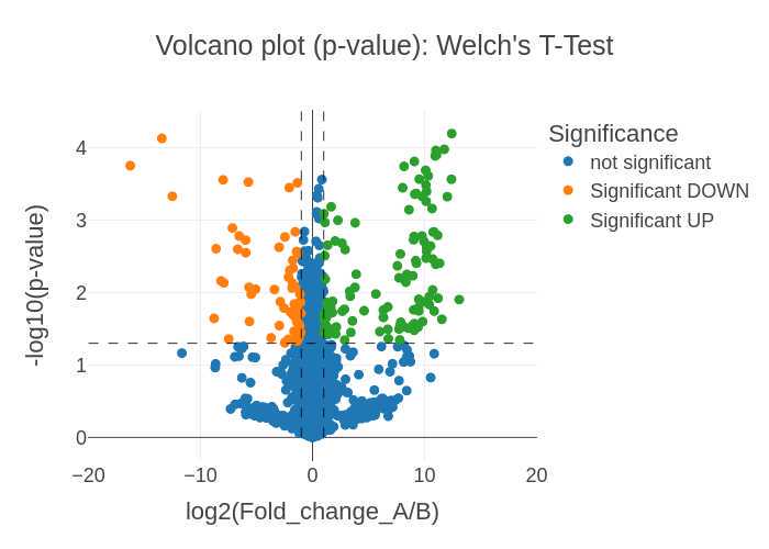
- Volcano plots visualizing the Welch's t-test p-value significance and log(2) normalized Fold Change (FC) between the two samples (.png, .svg, and .plotly formats)
- Volcano plots visualizing the t-test adjusted p-value (Benjamini-Hochberg) significance and log(2) normalized Fold Change (FC) between the two samples (.png, .svg, and .plotly formats)
Steps
Data processing
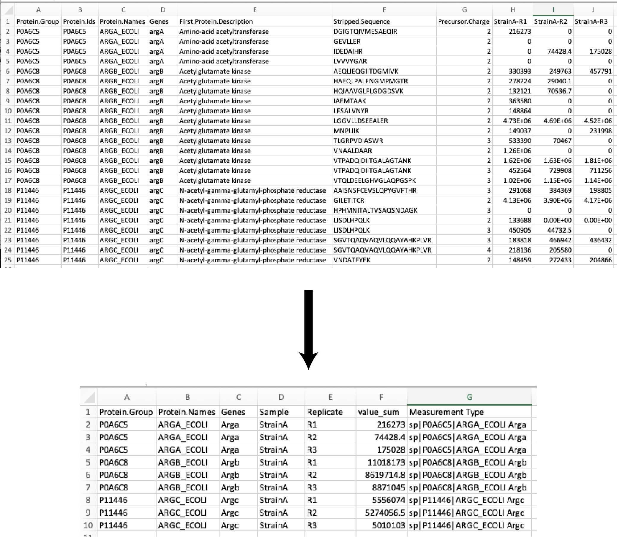
We start with a DIA data acquisition peptide search output file the DIANN search (DIA; link to DIA-NN paper) and we trim out unused columns in the reports to simplify the analysis.
DIA-NN report restricted to:
- Protein.Group
- Protein.Name
- Genes
- Protein.Description
- Sample
- Replicate
- Abundance value (Peptide peak area in arbitrary units)
The peptide abundance values are summed to the protein abundances. The resulting data table is exported as:
Full_list_proteins_XXXXXXXXX-xxxxxxx.csv
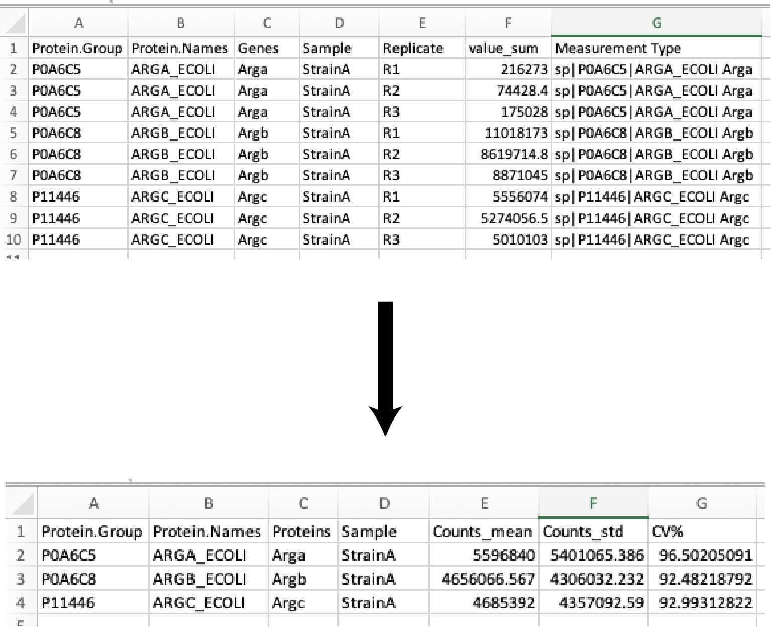
Then the protein abundances of the sample replicates are averaged (mean), the standard deviation (SD), and percent coefficient of variation (CV%) are calculated. The resulting data table is exported as:
Full_list_proteins_summary_XXXXXXXXX-xxxxxxx.csv
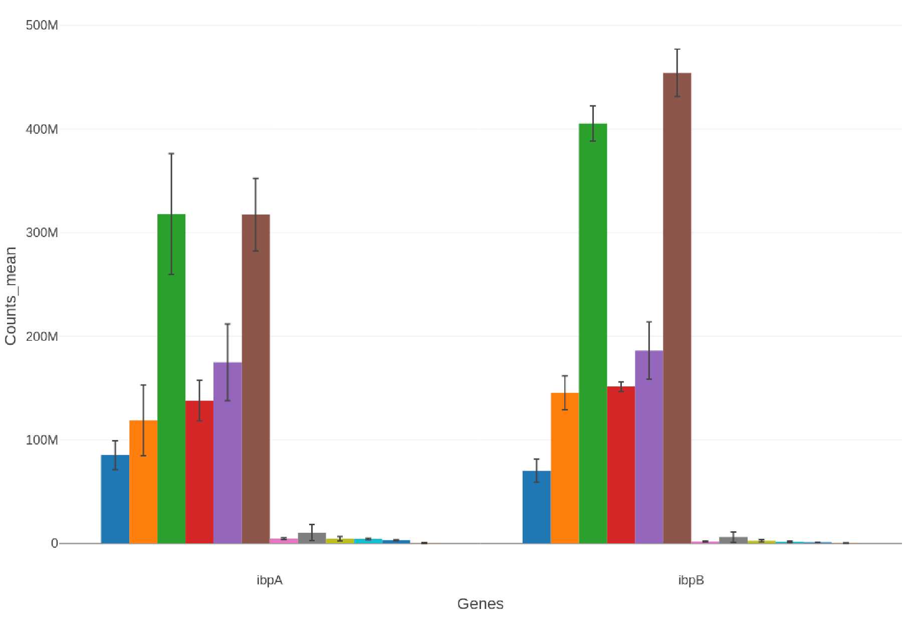
Selected Proteins: Bar Charts
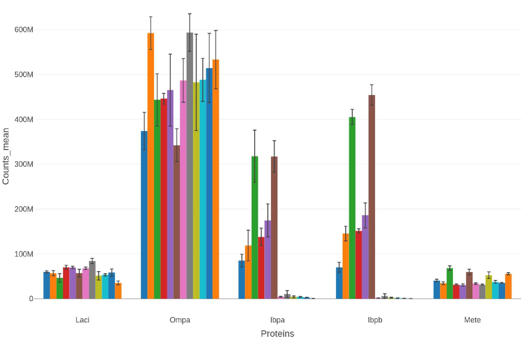
If a list of selected proteins is provided bar charts are generated in .png, .svg, and .plotly formats:
-
Proteins selectproteins-bar_XXXXXXXX-xxxxxx.png
  selectproteins-bar_XXXXXXXX-xxxxxx.svg

  selectproteins-bar_XXXXXXXX-xxxxxx.plotly
If other commonly analyzed proteins (e.g., insoluble protein diagnsotic marker proteins, proteases, heat shock proteins) are detected and quantified then a bar chart is generated in .png, .svg, and .plotly formats with only the corresponding data:
Example filenames:
insol-marker-bar_XXXXXXXX-xxxxxx.png
insol-marker-bar_XXXXXXXX-xxxxxx.svg
insol-marker-bar_XXXXXXXX-xxxxxx.plotly
Sample A-B comparisons: t-Test and volcano plots
If applicable, two samples (A and B) are selected for comparison then a Welch's t-Test is performed by using the ttest_ind_from_stats function from scipy (details here). This is comparable to the Excel function t-Test: Two-Sample Assuming Unequal Variances.
For this analysis:
- Missing values and zero abundance values are filled with '1000', a value that is just below our level of detection.
- Abundance values are log2 transformed prior to the t-Test
- The False Discovery Rate (FDR; adjusted p-value; q-value) is calculated by the Benjamini-Hochberg method by using the statsmodels.stats.multitest.multipletests function.
Significantly changing proteins are defined as:
- a p-value (or adjusted p-value) < 0.05
- a fold change of > 2 (UP) or < 0.5 (DOWN)
The resulting data tables are exported as:
Full t-test export:
t-Test_SampleA_OVER_SampleB_XXXXXXXX-xxxxxx.csv
Significant changing proteins (p-value <0.05):
t-Test_signifDOWN_SampleA_OVER_SampleB_XXXXXXXX-xxxxxx.csv
t-Test_signifUP_SampleA_OVER_SampleB_XXXXXXXX-xxxxxx.csv
Significant changing proteins (adjusted p-value <0.05):
t-Test_signifDOWN_adj-p_SampleA_OVER_SampleB_XXXXXXXX-xxxxxx.csv
t-Test_signifUP_adj-p_SampleA_OVER_SampleB_XXXXXXXX-xxxxxx.csv
If a list of selected proteins is provided two volcano plots are generated in .png, .svg, and .plotly formats (six total volcano plot visualization outputs) for the two sample comparisons:
-
log2 (Fold change) vs. -log10(p-value) plots Volcano_plot_p-value_SampleA_OVER_SampleB_XXXXXXXX-xxxxxx.png
Volcano_plot_p-value_SampleA_OVER_SampleB_XXXXXXXX-xxxxxx.svg Volcano_plot_p-value_SampleA_OVER_SampleB_XXXXXXXX-xxxxxx.plotly -
log2 (Fold change) vs. -log10(adjusted-p-value) plots Volcano_plot_adj-p-value_SampleA_OVER_SampleB_XXXXXXXX-xxxxxx.png
  Volcano_plot_adj-p-value_SampleA_OVER_SampleB_XXXXXXXX-xxxxxx.svg


  Volcano_plot_adj-p-value_SampleA_OVER_SampleB_XXXXXXXX-xxxxxx.plotly
The significance cutoffs are defined as:
- Fold Change = 0.5x and 2x (-1 and 1 on the log2 axis)
- p-value and adj-p-value = 0.05 (1.3 on the -log10 axis)
