Geographic Information Systems (GIS)-based spatial analysis of cell distribution
Adalberto Merighi, Laura Lossi
GIS-based spatial analysis
Average Nearest Neighbor
Spatial Autocorrelation (Global Moran’s I)
Multi-distance Spatial Cluster Analysis (Ripley’s K Function)
High/Low Clustering (G tool)
Anselin Local Moran’s I
Getis-Ord G*
Cerebellum
Purkinje neurons
Development
Organotypic cultures
Disclaimer
DISCLAIMER – FOR INFORMATIONAL PURPOSES ONLY; USE AT YOUR OWN RISK
The protocol content here is for informational purposes only and does not constitute legal, medical, clinical, or safety advice, or otherwise; content added to protocols.io is not peer-reviewed and may not have undergone formal approval of any kind. Information presented in this protocol should not substitute for independent professional judgment, advice, diagnosis, or treatment. Any action you take or refrain from taking using or relying upon the information presented here is strictly at your own risk. You agree that neither the Company nor any of the authors, contributors, administrators, or anyone else associated with protocols.io, can be held responsible for your use of the information contained in or linked to this protocol or any of our Sites/Apps and Services.
Abstract
This protocol describes how to perform a Geographic Information System (GIS)-based spatial analysis of cerebellar images focused on the distribution of the Purkinje neurons. It can be used for any biological images to study cellular or molecular spatial distributions, or, more generally, the distribution of any biological feature of interest.
It is based on using ESRI ArcMap to calculate several indexes of geographical distribution ( Central Feature , Mean Center , Median Center , Directional Distribution , and Standard Distance ), pattern distribution ( Average Nearest Neighbor , Getis-Ord General G , Ripley’s K function , and Global Moran’s I ), and clusters mapping ( Anselin Local Moran’s I , and Getis-Ord G* ). It is also shown how to represent the features' distribution graphically with different symbologies.
Before start
Familiarize yourself with the basics of spatial statistics.
GIS-based technologies are used to store, view, analyze, and interpret geographic data. The location of features (i.e. the objects of interest in a study) is determined by geographic data, often called spatial or geospatial data. As microscopic images can be represented in an X-Y Cartesian coordinate system, GIS can perform spatial analysis of specific biological features, i.e. the positions of the cerebellar Purkinje neurons as described in this protocol. A flowchart of the steps of GIS-based analysis is shown in the Figure below.
Flowchart of the main steps of GIS-based analysis with ArcMap. The top row blocks show the preliminary steps to create a map starting from the X-Y coordinates of the PNs (blue blocks) and the steps of tessellation and joining of Purkinje neuron numbers to tessellated areas (green blocks). The other blocks show the main steps in the use of Geographic Distribution (light blue blocks), Analyzing Patterns (gray blocks), and Mapping Clusters (brown blocks) tools in ArcMap." loading="lazy" title="
Flowchart of the main steps of GIS-based analysis with ArcMap. The top row blocks show the preliminary steps to create a map starting from the X-Y coordinates of the PNs (blue blocks) and the steps of tessellation and joining of Purkinje neuron numbers to tessellated areas (green blocks). The other blocks show the main steps in the use of Geographic Distribution (light blue blocks), Analyzing Patterns (gray blocks), and Mapping Clusters (brown blocks) tools in ArcMap."/>
Steps
Calculation of cells X-Y coordinates
Open the image to be analyzed using Fiji : File → Open
Set the appropriate scale for the image using Analyze → Set Scale . In the pop-up window report the distance in pixels related to the known distance using the correct unit of length (μM). Leave the pixel aspect ratio at 1.0.
Use the Multipoint tool and click with the mouse on the center of each labeled cell. The tool should be configured so that clicked cells are visualized directly on the image. To do so double-click with the mouse on the tool icon and tick the Label points box.
Set the measurements to be computed using Analyze → Set Measurements . In the pop-up window verify that all boxes are not ticked. Set the Decimal places box to 3. Use Analyze → Measure to calculate the X-Y coordinates. A new window pops up where the results are shown in tabular form.
Save data as a .csv file .
Initial image elaboration with ArcMap
Load all .csv files to an ad hoc folder in ArcMap.
Open the program and create a new map document: File → New → New Maps → My Templates → Blank Map .
On the ribbon click View → Data Frame Propertie s. In the pop-up window click Coordinate System . Click on the world icon and select New → Projected Coordinate System . For Name type the name of the new coordinate system e.g. Microscope Coordinate System . For Linear Unit Name choose Millimeter. Leave all other parameters unchanged. Save the new coordinate system: the program creates a new folder named Custom that contains the file Microscope_Coordinate_System .
• Save the Blank Map file and name it with the name of the image under investigation, e.g. Image1. The program saves a file named Image1.mdx
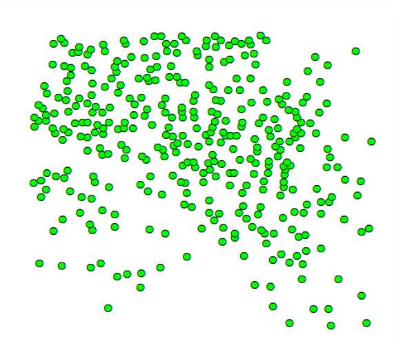
Add the X-Y coordinates of the cells to the map. On the toolbar click the Add data icon then → Add Data . Choose the .csv file with the X-Y coordinates of the cells and upload it. The program creates a new layer on the map with the same name as the .csv file and an attribute table containing the cell coordinates. Right-click with the mouse on the new layer and choose Display XY Data . In the pop-up window, be sure that the X and Y fields for the layer correspond to the fields of X and Y coordinates in your .csv file , and press the OK button. A window appears with the warning Table Does Not Have Object-ID Field . This is because the layer created so far is an X-Y event layer that must be converted into a feature layer for further analysis. Press the OK button and the positions of the cells will be displayed as in the figure below.
![Left: Original image of a cerebellar slice from a mutant mouse (Reeler) after labeling of the Purkinje neurons (see Merighi A and Lossi L. Co-cultures of cerebellar slices from mice with different reelin genetic backgrounds as a model to study cortical lamination [version 1; peer review: 2 approved with reservations]. F1000Research 2022, 11:1183 (https://doi.org/10.12688/f1000research.126787.1). Right: X-Y coordinates of the labeled Purkinje neurons as they appear in the data view window of ArcMap. Cells are displayed as black dots but one can choose any type of symbology for their visualization. Left: Original image of a cerebellar slice from a mutant mouse (Reeler) after labeling of the Purkinje neurons (see Merighi A and Lossi L. Co-cultures of cerebellar slices from mice with different reelin genetic backgrounds as a model to study cortical lamination [version 1; peer review: 2 approved with reservations]. F1000Research 2022, 11:1183 (https://doi.org/10.12688/f1000research.126787.1). Right: X-Y coordinates of the labeled Purkinje neurons as they appear in the data view window of ArcMap. Cells are displayed as black dots but one can choose any type of symbology for their visualization.](https://static.yanyin.tech/literature_test/protocol_io_true/protocols.io.ewov1o697lr2/me79bt5rp2.jpg)
Convert the X-Y event layer into a feature layer. On the layer right-click → Data → Export Data → All features . Select Use the same coordinate system as this layer source data and press OK . The program generates a new layer named Export_Output#_ . By double-clicking with the mouse on the layer name, the Layer Properties window opens and it is possible to customize the data by e.g. changing the layer name and using a different symbology to display the cells.
Visualization of cell counts and preliminary steps for subsequent analyses
Graphical visualization of cell counts
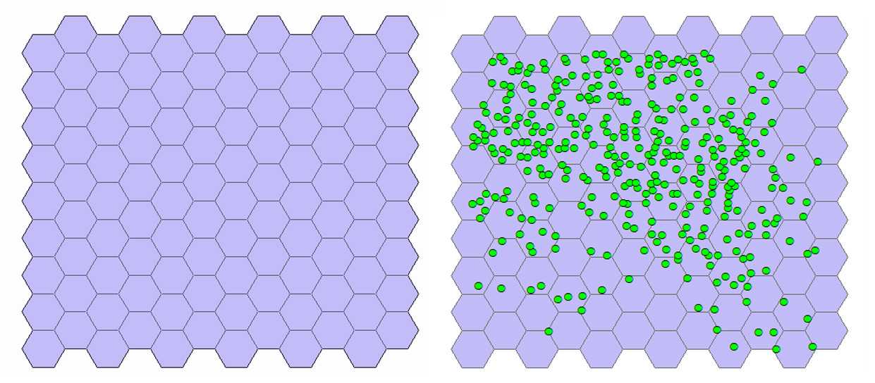
By this approach, it is possible to display graphically on the map a series of polygons (tessellation) over the labeled cells and to join the cell counts to each polygon so that a graphic display of the cell distribution is obtained.
Generate tessellation. With the mouse select the Export_Output # layer. On the toolbar select the Arc Toolbox icon then → DataManagementTools → Sampling → GenerateTessellation . This tool generates a polygon feature class of a tessellated grid of regular polygons which will entirely cover a given extent. In the pop-up window leave unchanged the path of the Output Feature Class. For Extent click on the folder icon and choose Same as layer Export Output # . Selection of the shape type is optional. Check that HEXAGON is selected by the program. The program creates a new layer named Generate Tessellation # and the tessellation appears above the cells (see figure below).
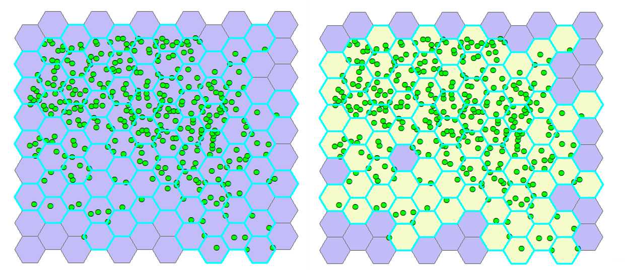
Select hexagons with cells. From the ribbon click Selection → Selectbylocation . In the pop-up window, for Target layer(s) select Generate tessellation # , for the Source layer select Export_Output # , and for the Spatial selection method for target layer feature(s) choose Intersect the source layer feature . Click OK. The hexagons containing cells are highlighted (see the figure below at left).
Join cell positions to selected hexagons. Select the Arc Toolbox icon on the toolbar→ AnalysisTools → Overlay → SpatialJoin . In the pop-up window, for Target features select Generate Tessellation # , for Join Features select Export_Output # . The program creates a new layer named Export_Output # SpatialJoin# Export_Output # SpatialJoin# with the hexagons containing cells visualized in a different color than those with no cells (see the figure below at right).
Graphical visualization of the cell counts on the map. Remove the layer Generate Tessellation # from the map (right-click with the mouse) and turn off the visibility of the layer Export Output # . Only the hexagons with cells remain visible (see the figure below at left). With the mouse right-click on layer → Properties → Symbology → Show quantities → Select color ramp (e.g. cyan-to-purple) → Fields : Value = Join-Count ; Normalization = none . Hexagons on the map are displayed in different colors according to the number of cells that they contain (see the figure below at right).
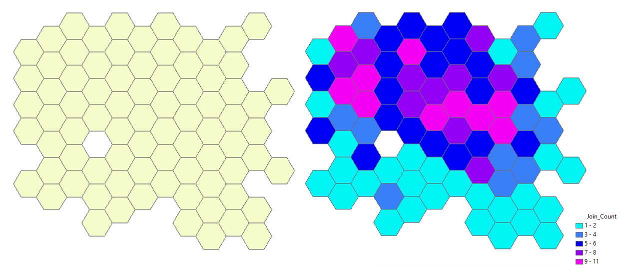
Analysis of the geographic distribution of the Purkinje neurons
Use the tools listed in the table below to analyze some characteristics of the distribution of the Purkinje neurons. These tools are used to calculate a value that represents certain characteristics of
the distribution of the objects under study, such as the center, compactness, or orientation. The Central Feature tool identifies the most centrally located feature (i.e. a Purkinje neuron), the Mean Center tool identifies the geographic center (or the center of concentration) for the set of Purkinje Neurons, and the Median Center tool identifies the location that minimizes the overall Euclidean distance of the Purkinje Neurons. The Standard Distance tool measures the degree to which features are concentrated or dispersed around the geometric mean center. The Directional Distribution tool creates standard deviational ellipses or ellipsoids to summarize the spatial trend in the distribution of the Purkinje Neurons.
| A | B | C | D | E |
|---|---|---|---|---|
| Tools | Input Feature Class | Output Feature Class | Distance Method | Ellipse or Circle Size |
| Central Feature | See Step 11 above | Export_Output_# Central Feat | EUCLIDEAN DISTANCE | Not Applicable |
| Mean Center | Export_Output_#MeanCenter | Not Applicable | ||
| Median Center | Export_Output_#Median Center | |||
| Directional Distribution (Deviational Ellipse) | Export_Output_#Directional | 1 STANDARD DEVIATION | ||
| Standard Distance | Export_Output_#StandardDis |
Steps and settings in the use of the Measuring Geographic Distributions tools of ArcMap
The image below shows the results of these tools applied to a set of 100 randomly generated points (cells) in the 2D space.

Analysis of the pattern of Purkinje neuron distribution
Average Nearest Neighbor
The Average Nearest Neighbor tool calculates the nearest neighbor index based on the average distance from each feature (i.e. a labeled Purkinje neuron) to its nearest neighboring feature. The tool returns five values: Observed Mean Distance (OMD) , Expected Mean Distance (EMD) , Nearest Neighbor Index (R) , z-score , and p-value . The values are written as messages at the bottom of the Geoprocessing pane during tool execution and passed as derived output values. With the Generate Report box ticked the tool produces an HTML report file with a graphical summary of the results (see figure below).
The nearest neighbor ratio (R) is the ratio between the OMD and EMD among the feature(s) of interest. EMD is the mean distance between the Purkinje neurons calculated on a hypothetical random distribution of the same number of cells covering the same total area. The value of R = 1 indicates randomness; R = 0 indicates maximum aggregation; and R = 2.149 indicates maximum possible dispersion.
On the toolbar select the Arc Toolbox icon then → Spatial Statistics Tools → Analyzing Patterns → Average Nearest Neighbor .
In the pop-up windows for _Input Feature Class_ select ***Export Output #*** , for _Distance Method_ , select ***EUCLIDEAN DISTANCE*** , and tick the box ***Generate Report*** .
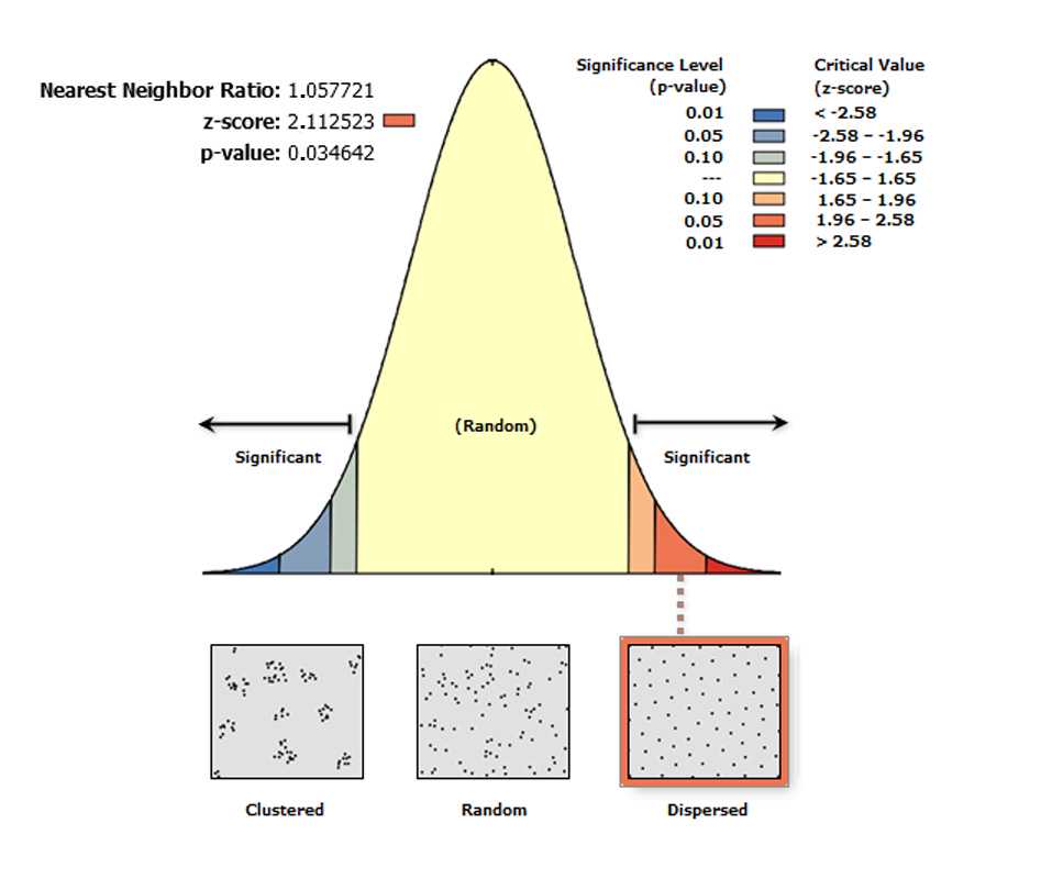
High/Low Clustering (G tool)
The High/Low Clustering tool measures the degree of clustering for either high or low values using the Getis-Ord General G statistic . The High/Low Clustering tool returns four values: Observed General G , Expected General G , z-score , and p-value . The values are written as messages at the bottom of the Geoprocessing pane during tool execution and passed as derived output values. With the Generate Report box ticked the tool generates an HTML report file with a graphical summary of results.
On the toolbar select the Arc Toolbox icon then → Spatial Statistics Tools → Analyzing Patterns → High/Low Clustering (Getis-Ord General G)
In the pop-up windows for Input Feature Class select Export Output # , for Input Field select XM , for Conceptualization of Spatial Relationship select INVERSE DISTANCE , for Distance Method , select EUCLIDEAN DISTANCE , for Standardization select NONE , and tick the box Generate Report .
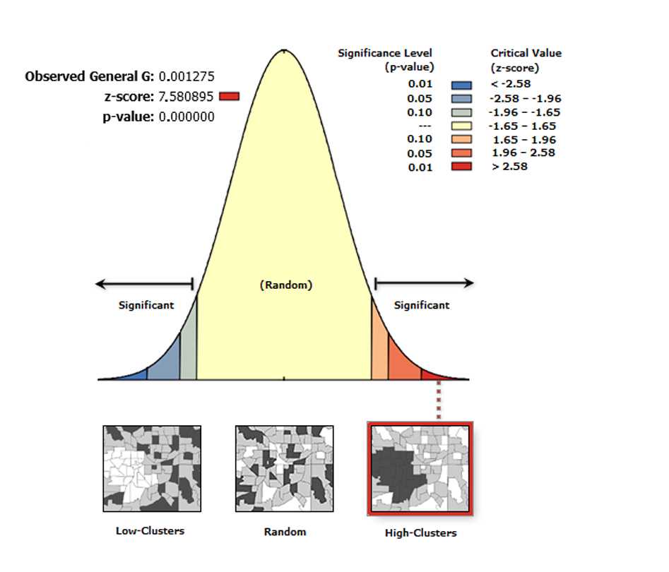
Spatial Autocorrelation (Global Moran’s I)
The Spatial Autocorrelation (Global Moran’s I) tool measures spatial autocorrelation based on feature locations and attribute values using the Global Moran's I statistic.
The tool returns five values: Moran's I Index , Expected Index , Variance , z-score , and p-value. The values are written as messages at the bottom of the Geoprocessing pane during tool execution and passed as derived output values. With the Generate Report box ticked the tool produces an HTML report file with a graphical summary of results (see figure below).
Moran’s I index is a measure of spatial autocorrelation that can vary from -1 to 1, with 0 indicating perfect randomness. When the p-value or z-score indicates statistical significance, a positive Moran's I index value indicates a tendency toward clustering, while a negative Moran's I index value indicates a tendency toward dispersion.
On the toolbar select the Arc Toolbox icon then → Spatial Statistics Tools → Analyzing Patterns → Spatial Autocorrelation (Global Moran’s I) .
In the pop-up windows for Input Feature Class select GenerateTessellation#Spati# , for Input Field select Join-Count, for Conceptualization of Spatial Relationship select INVERSE_DISTANCE , for Distance Method select EUCLIDEAN DISTANCE , for STANDARDIZATION select ROW . Tick Generate Report and click OK .
After the tool has run, no layer is added to the map but a report is generated. To view the report in the ribbon, click Geoprocessing → Results .
In the results list, expand the Spatial Autocorrelation (Moran's I) folder and click on the Report File to view the report in the browser window (see figure below). The report file is automatically saved as a .html file in the ArcGIS folder of the computer.
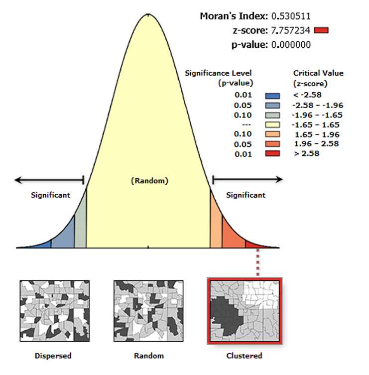
Multi-Distance Spatial Cluster Analysis (Ripley’s K Function)
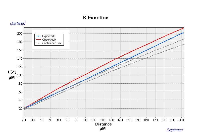
The Multi-Distance Spatial Cluster Analysis (Ripley's K Function) determines whether features or the values associated with features exhibit statistically significant clustering or dispersion over a range of distances . The tool output is a table with two fields: ExpectedK and ObservedK containing the expected and observed K values, respectively. Because the L(d) transformation is applied, the ExpectedK values will always match the Distance value. A field named DiffK contains the Observed K values minus the Expected K values. As a confidence interval option is specified, two additional fields named LwConfEnv and HiConfEnv will be included in the Output Table .
On the toolbar select the Arc Toolbox icon then → Spatial Statistics Tools → Analyzing Patterns → Multi-distance spatial cluster analysis (Ripley’s K function) .
In the pop-up windows for Input Feature Class select Export Output # for Output Table leave the program generated name ( Export Output # MultiDistan) , for Compute Confidence Envelope (optional) choose 99_PERMUTATIONS , tick the box Display Results Graphically .
Mapping Purkinje neurons clusters
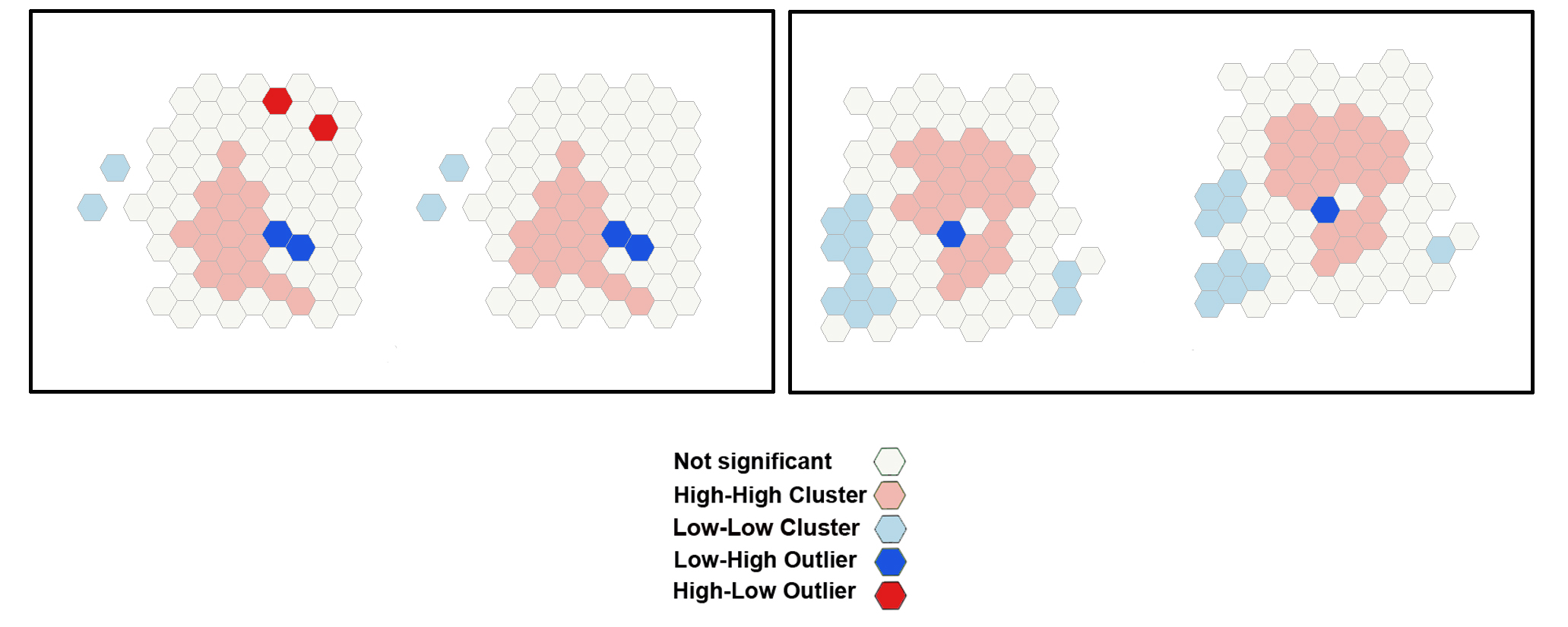
After the tool has run, a new layer is added to the map displaying in different colors statistically significant clusters and outliers for a 95 percent confidence level based on the local I index
Cluster and Outlier Analysis (Anselin Local Moran's I)
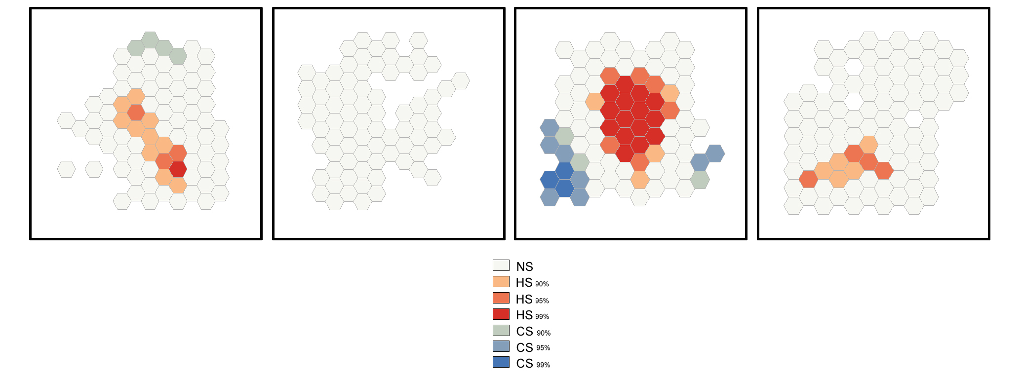
The Cluster and Outlier Analysis tool identifies spatial clusters of Purkinje neurons, with high or low values. The tool also identifies spatial outliers. The Cluster and Outlier Analysis (Anselin Local Moran's I) tool and the Optimized Outer Outlier Analysis tool (see Step 19) calculate a local Moran's I value (LM index the figure), a z-score, a pseudo-p-value, and a COType (Cluster/Outlier Type) field in the Output Feature Class (map layer) that identifies the cluster with a color code (last panel on the right) for each statistically significant feature . The z-scores and pseudo-p-values represent the statistical significance of the computed index values. A high positive z-score for a feature indicates that the surrounding features have
similar values (either high values or low values). The COType field in the Output Feature Class will be HH for a statistically significant cluster of high values and LL for a statistically significant cluster of low values. A low negative z-score for a feature indicates a statistically significant spatial data
outlier. The COType field (last panel on the right) also identifies statistically significant high and low outliers (HL and LH), indicating if the feature has a high value and is surrounded by features with low values (HL) or if the feature has a low value and is surrounded by features with high values (LH).
The image below shows the results of the Cluster and Outlier Analysis tool applied to a set of 100 randomly generated points (cells) in the 2D space.

On the toolbar select the ArcToolbox icon then → Spatial Statistics Tools → Mapping Clusters → Cluster and Outlier Analysis (Anselin Local Moran's I) .
In the pop-up windows for the Input Feature Class select GenerateTessellation#Spati# , for the Input Field select Join-Count ; for Conceptualization of Spatial Relationship select INVERSE_DISTANCE , for Distance Method select EUCLIDEAN DISTANCE , for STANDARDIZATION select ROW . Click OK .
After the tool has run, a new layer is added to the map displaying in different colors statistically significant clusters and outliers for a 95% confidence level based on the local Moran I index.
Optimized Outlier Analysis
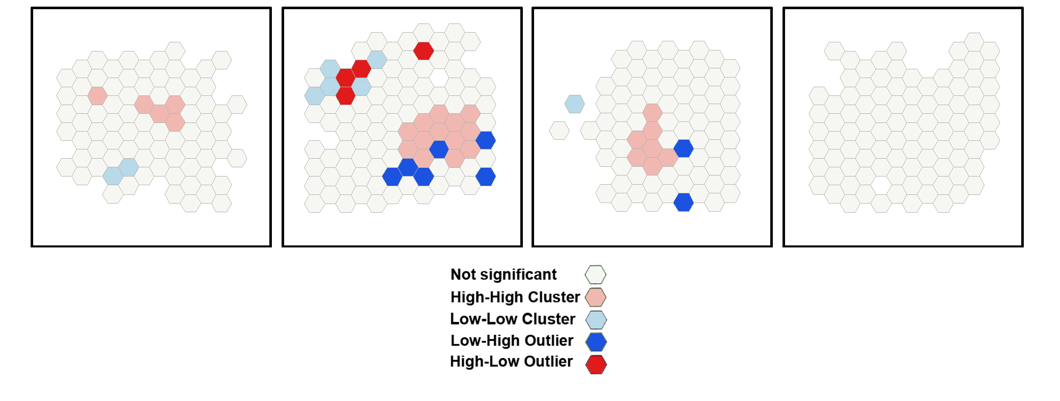
This tool identifies statistically significant spatial clusters of high values (hot spots) and low values (cold spots) as well as high and low outliers. It automatically aggregates incident data, identifies an appropriate scale of analysis, and corrects for both multiple testing and spatial dependence using the False Discovery Rate (FDR) correction method. By the Optimized Outlier Analysis, the COType field will always indicate statistically significant clusters and outliers based on an FDR-corrected 95% confidence level l.
The image below shows the results of the Optimized Outlier Analysis tool applied to a set of 100 randomly generated points (cells) in the 2D space.

On the toolbar select the ArcToolbox icon then → Spatial Statistics Tools → Mapping Clusters → Optimized Outlier Analysis .
In the pop-up windows for Input Feature Class select GenerateTessellation#Spati# , for Input Field select Join-Count ; for Conceptualization of Spatial Relationship select INVERSE_DISTANCE , for Distance Method select EUCLIDEAN DISTANCE , for STANDARDIZATION select ROW . Click OK .
After the tool has run, a new layer is added to the map displaying in different colors statistically significant clusters and outliers based on their z-scores.
Hot Spot Analysis (Getis-Ord Gi)*
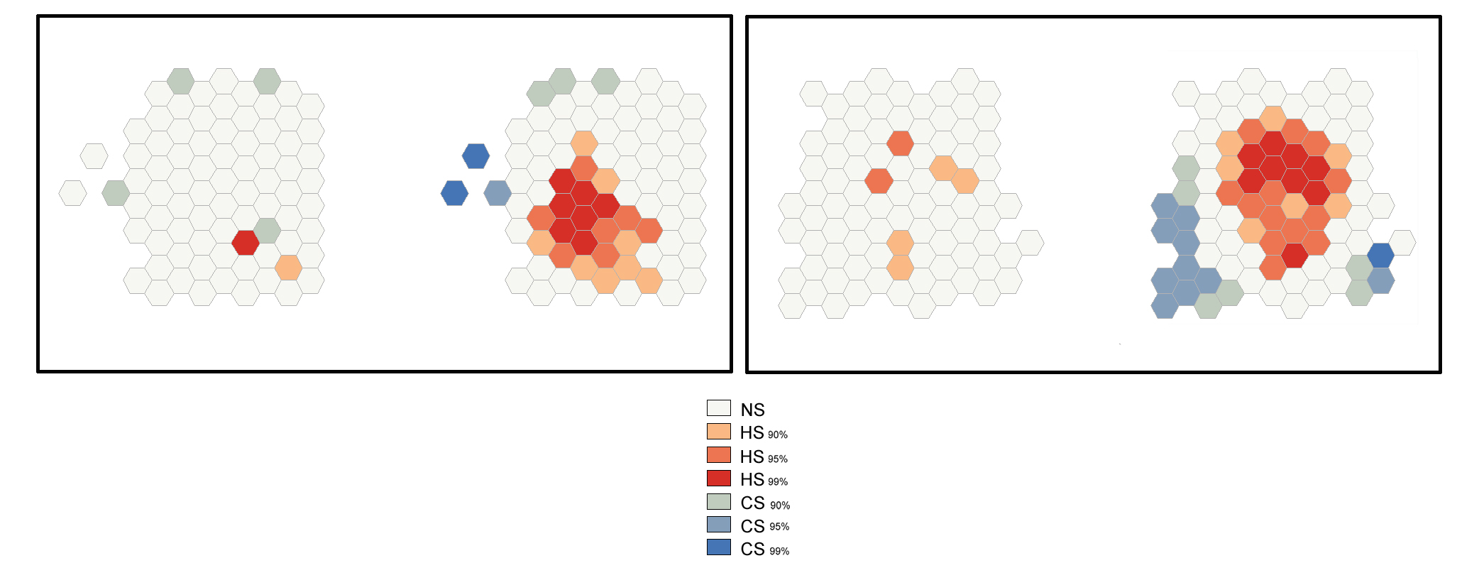
The Hot Spot Analysis tool calculates the Getis-Ord Gi* statistic of the Purkinje neurons' spatial distribution. The resultant z-scores and p-values show where high or low numbers of Purkinje neurons cluster spatially.
The image below shows the results of the Hot Spot Analysis (Getis-Ord Gi*) tool applied to a set of 100 randomly generated points (cells) in the 2D space.

On the toolbar select the ArcToolbox icon then → Spatial Statistics Tools → Mapping Clusters → Hot Spot Analysis (Getis-Ord Gi)* .
In the pop-up windows for Input Feature Class select GenerateTessellation#Spati# , for Input Field select Join-Count ; for Conceptualization of Spatial Relationship select INVERSE_DISTANCE , for Distance Method select EUCLIDEAN DISTANCE , for STANDARDIZATION select ROW . Click OK .
After the tool has run, a new layer is added to the map (Figure S5) displaying in different colors statistically significant spatial clusters of high values (hot spots) and low values (cold spots) based on their z-scores.
Optimized Hot Spot Analysis
The Optimized Hot Spot Analysis tool calculates the Getis-Ord Gi* statistic of the Purknje neurons' spatial distribution. It evaluates automatically the characteristics of the input feature class to produce optimal results.
The image below shows the results of the Optimized Hot Spot Analysis tool applied to a set of 100 randomly generated points (cells) in the 2D space.

On the toolbar select the ArcToolbox icon then → Spatial Statistics Tools → Mapping Clusters → Optimized Hot Spot Analysis .
In the pop-up windows for Input Feature Class select GenerateTessellation#Spati# , for Input Field select Join-Count ; for Conceptualization of Spatial Relationship select INVERSE_DISTANCE , for Distance Method select EUCLIDEAN DISTANCE , for STANDARDIZATION select ROW . Click OK .
After the tool has run, a new layer is added to the map displaying in different colors statistically significant spatial clusters of high values (hot spots) and low values (cold spots) based on their z-scores.
