Label-free quantification (LFQ) proteomic data analysis from DIA-NN output files
Yan Chen, Christopher J Petzold
Disclaimer
This protocol is for research purposes only.
Abstract
This protocol details the analysis of label-free quantification (LFQ) data from data independent acquisition (DIA) discovery (shotgun) proteomic experiments and generates a series of outputs.
Before start
INPUTS:
Required:
-
DIANN peptide report file (Experiment_report.pr_matrix.csv) Optional:
-
selected_proteins.csv - A list of selected proteins for bar chart visualization with Protein.Group identifiers (e.g., P0C054, P0C058)
-
selected-ttest-vol-samples.csv - A list of two-sample comparisons of different samples (Sample A vs. Sample B; Sample B vs. Sample C, etc.)
OUTPUTS:
Top level folder:
- DIA-NN peptide report output file (CSV) - a full list of precursor ion quantitative values
- Protein data table (CSV) - a full list of protein quantitative values from the summed peptide abundances
- Summary Protein data table (CSV) - a full list of protein quantitative values averaged over the sample replicates
- User provided selected_proteins and selected-ttest-vol-sample (CSV) files
If applicable:
- Summary of Bar charts (PDF)
- Summary of Strip charts (PDF)
- Summary of protein abundance histograms (PDF)
- Summary of Line charts (PDF; if timepoints are included in the sample names)
EDD_files folder:
- Protein data table in EDD upload format (CSV) - a full list of protein quantitative values from the summed peptide abundances in EDD data upload format with Time (e.g., 24h) and Units (e.g., counts)
- Top3 quantitative protein data table in EDD upload format (CSV) - a full list of protein quantitative values from the Top3 quantitative method in EDD data upload format with Time (e.g., 24h) and Units (e.g., % protein abundance)
QC_files folder:
- QC Protein counts bar chart (png) - a bar chart showing the number of proteins identified and quantified in each individual sample replicate, the cumulative number of proteins found in all the samples, and the number of proteins that meet the criteria for the Top3 quantitative method
- QC Peptide counts bar chart (png) - a bar chart showing the number of peptides identified and quantified in each individual sample replicate and the cumulative number of peptides found in all the samples
- QC Box plot (png) - of the relative peptide abundance (log2 counts) data for each sample replicate
- QC peptide CVs violin plot (png) - a violin plot showing the distribution of peptide CVs for each sample
Top3_quant_files folder:
- Top3 Summary Protein data table (CSV) - a full list of protein absolute abundance values averaged over the sample replicates
- Top3_Full_list_peptides_used_for_quant (CSV) - a full list of peptides and corresponding intensity values used for the Top3 absolute protein calculations.
- Top3 jitter plot (PNG, .plotly) - a plot detailing the distribution of proteins across the percentiles of abundance. Groups of proteins from the selected_proteins.csv file are highlighted.
If applicable:
Bar_Charts folder:
- Summary data table of a selected list of proteins (XLSX) - a list of selected protein quantitative values averaged over the sample replicates
- Individual bar charts of selected protein groups in .png, .svg, and .plotly formats
Strip_Charts folder:
- Individual strip charts of selected protein groups in .png, .svg, and .plotly formats
t-test_files folder:
- Excel file with the Welch's t-test results for each comparison
- Volcano plots visualizing the Welch's t-test p-value significance and log(2) normalized Fold Change (FC) between the two samples (.png, .svg, and .plotly formats)
- Volcano plots visualizing the t-test adjusted p-value (Benjamini-Hochberg) significance and log(2) normalized Fold Change (FC) between the two samples (.png, .svg, and .plotly formats)
Line_Charts folder (if timepoints are included in the sample names):
- Individual line charts of selected protein groups in .png, .svg, and .plotly formats
Steps
Data processing: Relative Counts
We start with a DIA data acquisition peptide search output file the DIANN search (DIA; link to DIA-NN paper) and we trim out unused columns in the reports to simplify the analysis.
DIA-NN report restricted to:
- Protein Group
- Protein Name
- Genes
- Protein Description
- Peptide Sequence
- Sample
- Replicate
- Intensity value (counts, peptide peak area in arbitrary units)
All of the peptide intensity values (counts) are summed to the protein intensity (counts). The resulting data table is exported as:
Full_list_proteins_XXXXXXXXX-xxxxxxx.csv

Then the protein intensities (counts) of the sample replicates are averaged (mean), the standard deviation (SD), percent coefficient of variation (CV%), and Z-scores (across all samples) are calculated. The resulting data table is exported as:
Full_list_proteins_summary_XXXXXXXXX-xxxxxxx.csv

QC plots
Found in the QC_files folder:
Bar plots of total proteins and peptides: The bar charts show the number of peptides or proteins identified and quantified by DIA-NN from each sample and the cumulative number for all the samples in the dataset. The protein plot also includes the number of proteins that meet the criteria for the Top3 protein quantification method.


Found in the PCA_plot folder:
PCA plot: The PCA plot shows clusters of individual sample replicates based on their similarity. The amount of explained variance contributed by the first two principal components (PC1 + PC2) is shown as the subtitle. This plot can help identify outliers and the overall precision of the data.

Scree plot: The scree plot displays the variation contributed by the top four principal components from the data.

PCA plot calculations:
- The data is scaled with the sklearn StandardScaler fit_transform method.
- The PCA is implemented with the sklearn PCA method. The number of principal components are limited to 4.
- Calculate the explained variance and the cumulative variance for the top two components
- Plot the 2D PCA graph
- Plot the Scree graph

Coefficient of variation (CV) violin plot:

Top3 absolute protein abundance quantification
We use the Top3 quantification method (references below) to calculate the absolute protein abundance as fractions of total protein mass in each sample. Briefly, the Top3 quantification method is based on the “best flyer” hypothesis, which assumes that the specific MS signal intensity of the most intense tryptic peptides per protein is approximately constant throughout a whole proteome (ref: Ludwig et al. Mol. Cell. Proteomics 2012).
Our Top3 quantification analysis consists of:
- Filter the DIA-NN peptide report data (from step 1) to only proteins that have three or more peptides identified across all samples
- For each protein, rank the top 3 peptides by intensity (counts) in each of the samples
- Calculate the mean rankings of the peptides in each protein across all samples
- Filter the data to the three highest ranked peptides in each protein
- Calculate protein intensity (counts) by averaging the intensity (counts) of the Top3 peptides
- Calculate the percent of the total protein abundance ((intensity of individual protein / sum of all protein intensities in a given sample) * 100)
The resulting data tables are exported as:
Top3 full peptide list:
Top3_Full_list_peptides_used_for_quant_XXXXXXXX-xxxxxx.csv
Top3 full protein list for each replicate:
Top3_Full_list_proteins_XXXXXXXX-xxxxxx.csv
Top3 full list of proteins averaged across replicates:
Top3_Full_list_proteins_summary_XXXXXXXX-xxxxxx.csv
References:
Ludwig et al. DOI 10.1074/mcp.M111.013987
Silva et al. DOI 10.1074/mcp.M500230-MCP200
Ahrne et al. DOI 10.1002/pmic.201300135
Grossman et al. DOI 10.1016/j.jprot.2010.05.011
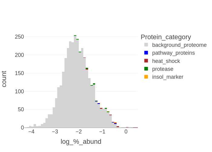
If a list of selected proteins is provided then a histogram for each sample is generated in .png, format with the categories of selected proteins highlighted with the background proteome:
-
X-axis: log10 (% protein abundance) bins
-
Y-axis: count of proteins in the bins
-
Files generated: SampleID-histogram_XXXXXXXX-xxxxxx.png

-
Files generated: Top3_allsamples_jitterplot_XXXXXXXX-xxxxxx.png
Top3_allsamples_jitterplot_XXXXXXXX-xxxxxx.plotly
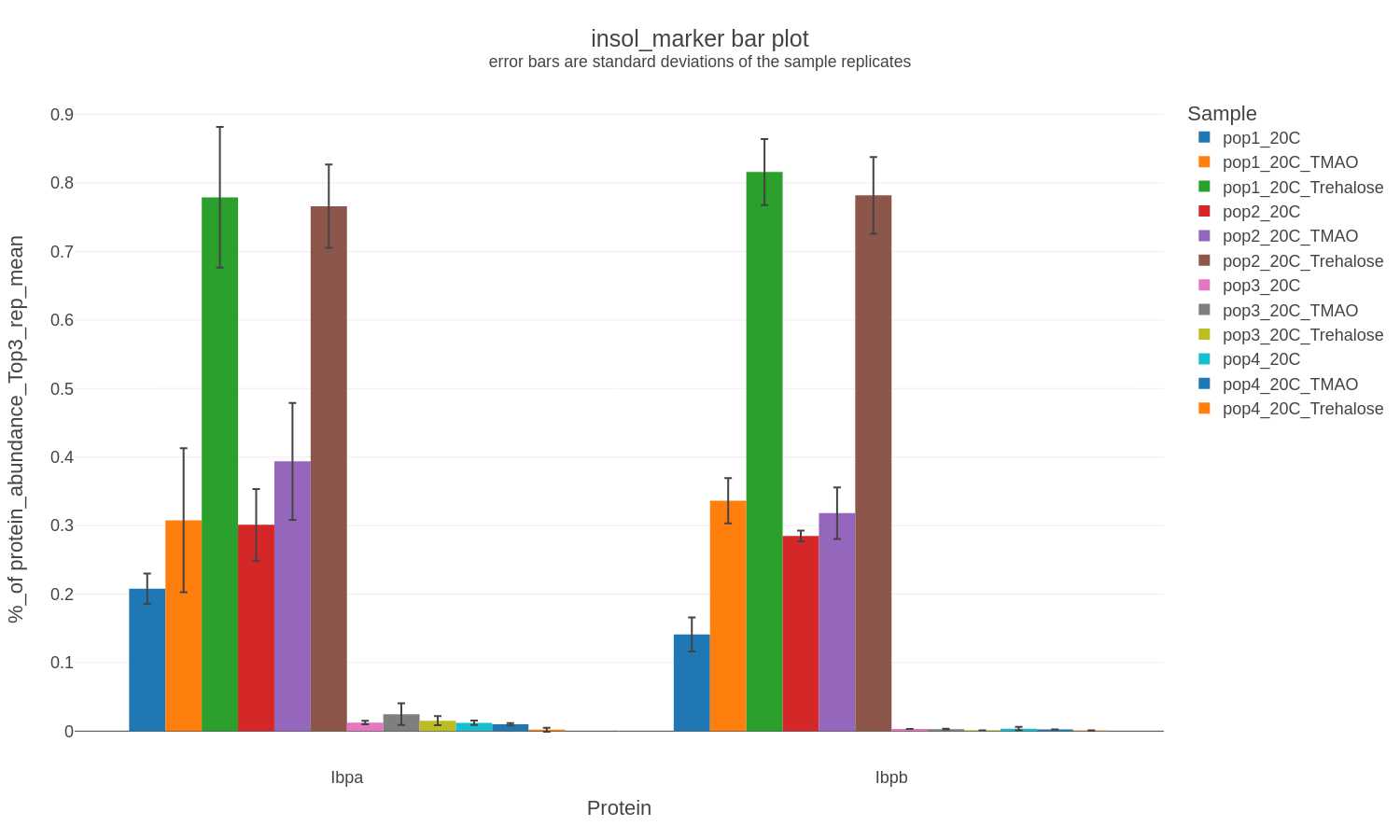
Selected Proteins: Bar Charts
If a list of selected proteins is provided bar charts are generated in .png, .svg, and .plotly formats:
-
X-axis: Proteins
-
Y-axis: % protein abundance (from Top3 quantification method) averaged over replicates
-
Error bars: standard deviation of % protein abundance (from Top3 quantification method) from the replicates
-
Files generated: Full_and_select_proteins_summary_XXXXXXXX-xxxxxx.xlsx
  selectproteincategory-bar_XXXXXXXX-xxxxxx.png

  selectproteincategory-bar_XXXXXXXX-xxxxxx.svg

  selectproteincategory-bar_XXXXXXXX-xxxxxx.plotly
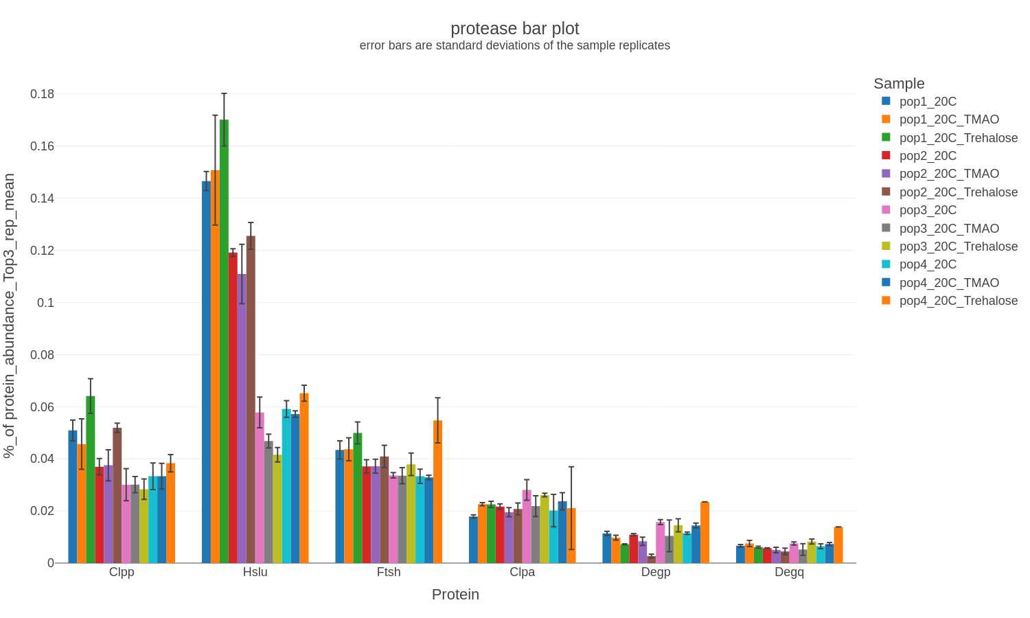
If other commonly analyzed proteins (e.g., insoluble protein diagnsotic marker proteins, proteases, heat shock proteins) are detected and quantified then a bar chart is generated in .png, .svg, and .plotly formats with only the corresponding data:
Example filenames:
insol-marker-bar_XXXXXXXX-xxxxxx.png
insol-marker-bar_XXXXXXXX-xxxxxx.svg
insol-marker-bar_XXXXXXXX-xxxxxx.plotly
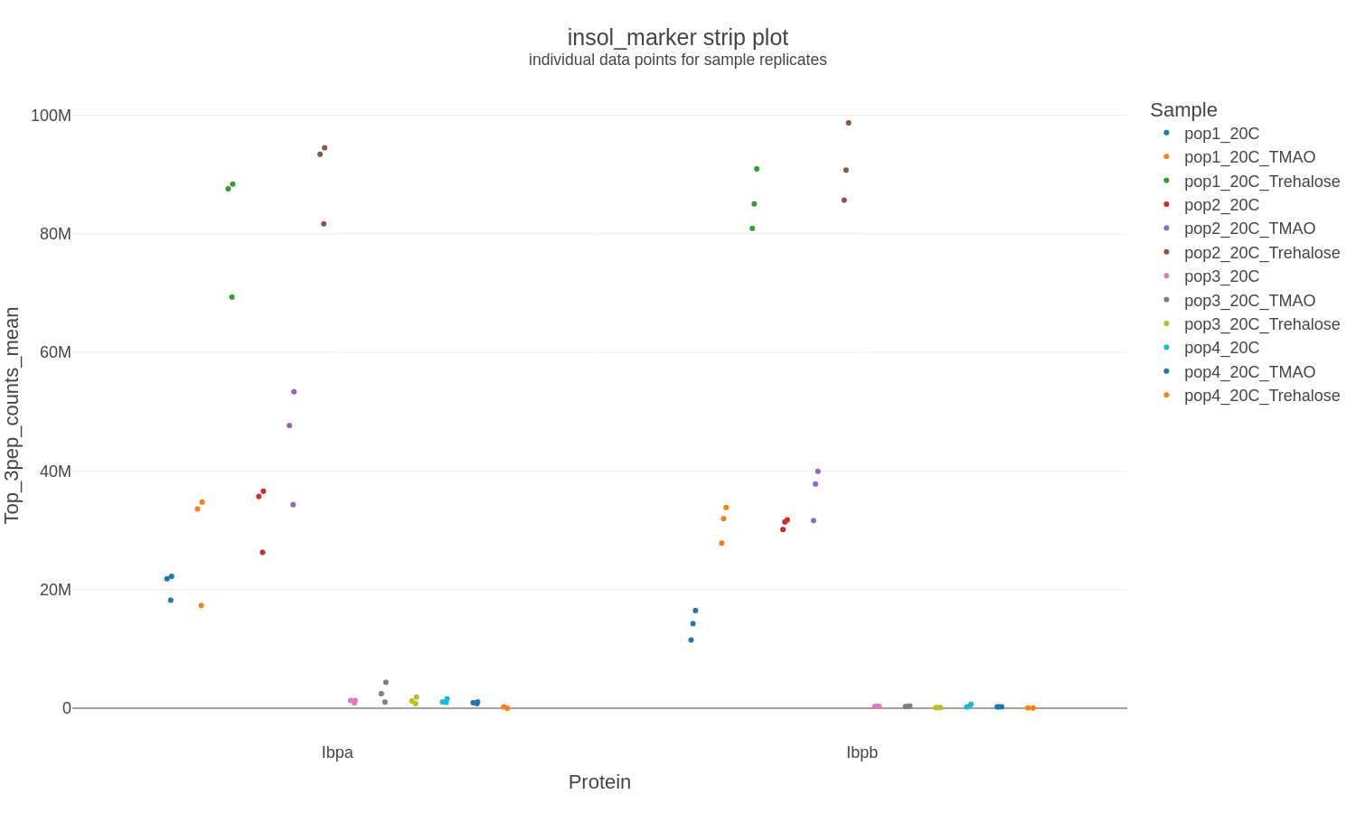
Selected Proteins: Strip Charts
If a list of selected proteins is provided strip charts are generated in .png, .svg, and .plotly formats to show the individual data points for each sample:
-
X-axis: Proteins
-
Y-axis: Protein intensity (counts) calculated from the mean of the top 3 peptides for each sample replicate
-
Error bars: none
-
Files generated: selectproteincategory-strip_XXXXXXXX-xxxxxx.png
  selectproteincategory-strip_XXXXXXXX-xxxxxx.svg

  selectproteincategory-strip_XXXXXXXX-xxxxxx.plotly
Selected Proteins: Line Charts
If a list of selected proteins is provided AND the sample names contain timepoint information (e.g., CJP1234_24hr-R1) line charts are generated in .png, .svg, and .plotly formats to show the individual data points for each sample:
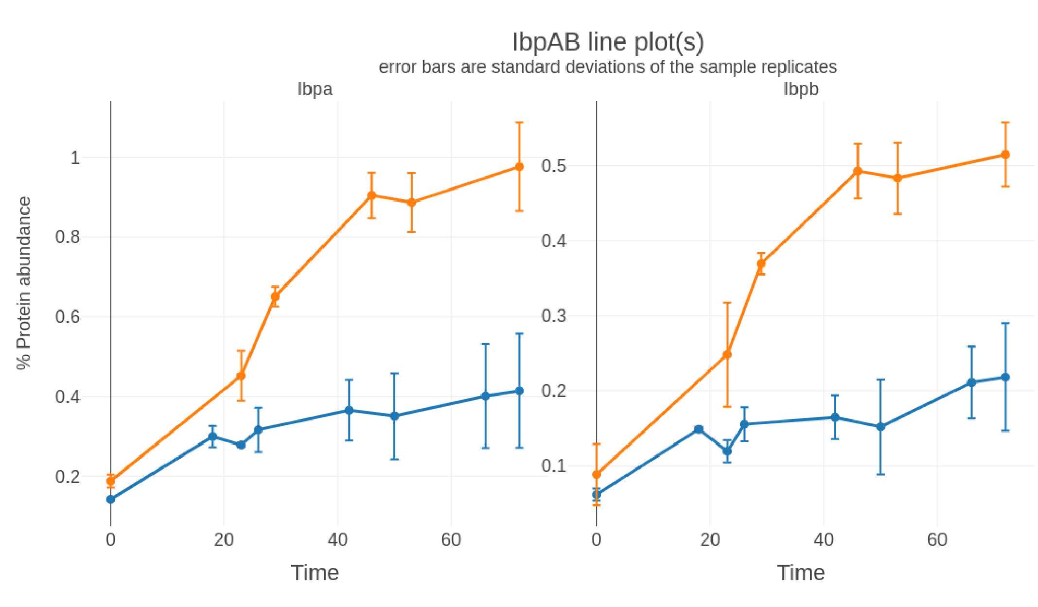
-
Sub-plot: Protein
-
X-axis: Time
-
Y-axis: % protein abundance (Top3 method)
-
Error bars: standard deviation of % protein abundance (Top3 method) from the replicates
-
Files generated: selectproteincategory-line_XXXXXXXX-xxxxxx.png
  selectproteincategory-line_XXXXXXXX-xxxxxx.svg

  selectproteincategory-line_XXXXXXXX-xxxxxx.plotly
Sample A-B comparisons: t-Test and volcano plots
If applicable, two samples (A and B) are selected for comparison then a Welch's t-Test is performed by using the ttest_ind_from_stats function from scipy (details here). This is comparable to the Excel function t-Test: Two-Sample Assuming Unequal Variances.
For this analysis:
- Missing values and zero abundance values are imputed with the lowest of detected (LOD) value in each sample.
- Abundance values are log2 transformed prior to the t-Test
- The False Discovery Rate (FDR; adjusted p-value; q-value) is calculated by the Benjamini-Hochberg method by using the statsmodels.stats.multitest.multipletests function.
Significantly changing proteins are defined as:
- a p-value (or adjusted p-value) < 0.05
- a fold change of > 2 (UP) or < 0.5 (DOWN)
The resulting data tables are exported as an Excel file (xlsx):
t-Test_SampleA_OVER_SampleB_XXXXXXXX-xxxxxx.csv
with five sheets corresponding to:
- Full t-test output
- p-value Significant UP changing proteins (p-value <0.05)
- p-value Significant DOWN changing proteins (p-value <0.05)
- adjusted p-value Significant UP changing proteins (adjusted p-value <0.05)
- adjusted p-value Significant DOWN changing proteins (adjusted p-value <0.05)
If a list of selected proteins is provided two volcano plots are generated in .png, .svg, and .plotly formats (six total volcano plot visualization outputs) for the two sample comparisons:
-
log2 (Fold change) vs. -log10(p-value) plots Volcano_plot_p-value_SampleA_OVER_SampleB_XXXXXXXX-xxxxxx.png
Volcano_plot_p-value_SampleA_OVER_SampleB_XXXXXXXX-xxxxxx.svg Volcano_plot_p-value_SampleA_OVER_SampleB_XXXXXXXX-xxxxxx.plotly -
log2 (Fold change) vs. -log10(adjusted-p-value) plots Volcano_plot_adj-p-value_SampleA_OVER_SampleB_XXXXXXXX-xxxxxx.png
  Volcano_plot_adj-p-value_SampleA_OVER_SampleB_XXXXXXXX-xxxxxx.svg


  Volcano_plot_adj-p-value_SampleA_OVER_SampleB_XXXXXXXX-xxxxxx.plotly
The significance cutoffs are defined as:
- Fold Change = 0.5x and 2x (-1 and 1 on the log2 axis)
- p-value and adj-p-value = 0.05 (1.3 on the -log10 axis)